Words I will journal by.

Create. Learn. Try. Believe you can.

Friday 15 December 2017

Another step on this journal's art journey!

Hi everyone!
I hope your Christmas preparations are going smoothly. I'm at a very 'relaxed' stage, having done all my Christmas present shopping and only just ordering the turkey today from our fantastic, local butcher - who I used to teach, actually! I'm popping by tonight with a short post explaining my latest contribution to Marie's Art journal. I'm currently hosting our third 'cycle' of a collection of art journals that are passed around a 'Circle of friends' month by month. The idea being that each of us complete at least one page of each other's journals before passing them on to the next person in the circle. It's great fun and very inspiring as the journals fill up with the most wonderful art as they progress around the circle. At the end of this cycle, a few of us are meeting up for an arty weekend together in the Peak District. So, what did I complete in Marie's art journal?

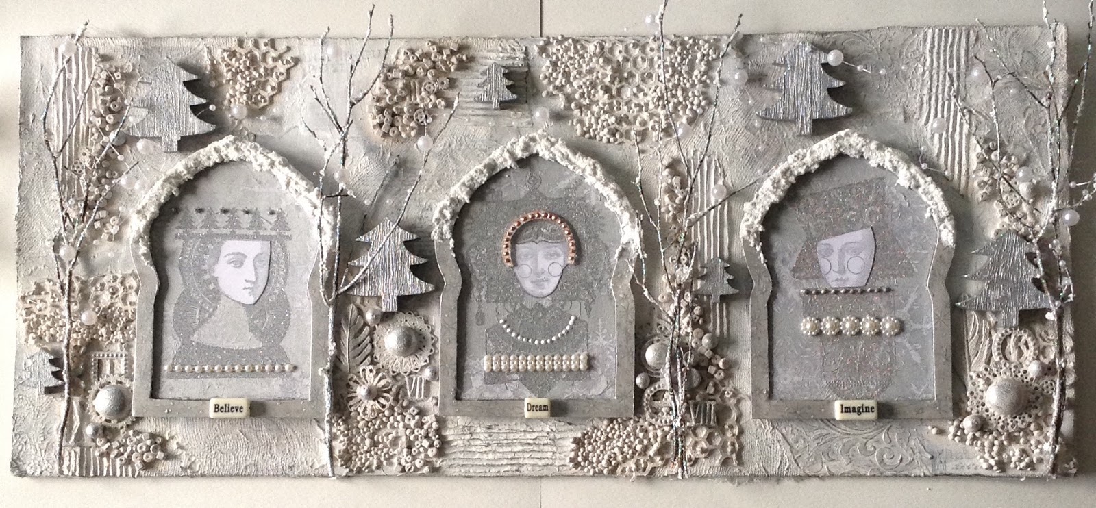
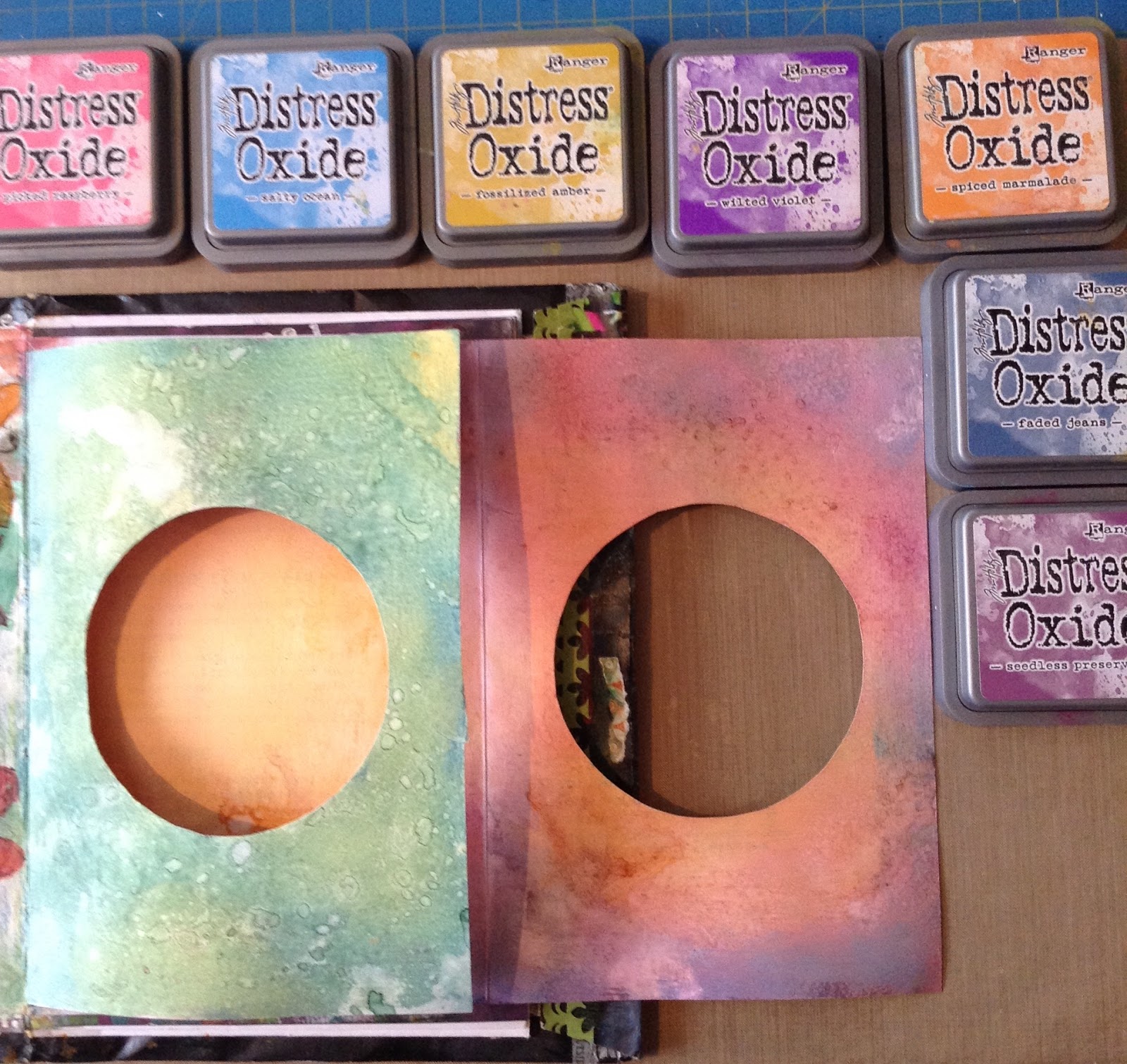
I really enjoyed completing this. I chose to use a little three-page booklet inside Marie's journal.  The image above are the three inside pages. The theme for this cycle was suggested by Julie Bell, to create our journals with envelopes. It's fascinating to see everyone's different interpretation of this theme. However, a three-page booklet resulted in me needing to complete six surfaces. As you can see, I decided to use some of my huge stash of Lavinia Stamps, available Here. I adore this range. The stamps are really good quality and deeply etched so the prints are always reliable. I decided to use Distress oxides for the backgrounds. Now I'm no expert with these and still learning what products work well/don't work well with oxides. 


I varied the colour combinations on the inside and outer surfaces and really went to town with my colour blending. I had already cut out a circle as I wanted to create a 'peep-hole' for the viewer to feel they were peeping through a landscape to see the fairies dancing in the moonlight. Well, that was the original plan, I'm not sure I achieved that but I am happy with the result. I hope Marie will be.


These are the colours I used for both the outer and the inner layers. I then splashed water across each of the surfaces before drying them off. You can't predict the lovely effects you get but each page was a lovely surprise!  Now it was just a matter of creating little fairy scenes for each surface while keeping the main focus on the centre page. It wasn't easy getting the main image absolutely central in the cut out circles but I don't think Marie will mind!


The page above is the first page. I just had to add some glitter to those fairy wings! 


When you open the first page this is what you see. You then open out the page on the right to reveal the centre, inner pages. 


And this is the final surface. I do hope you have enjoyed taking a closer look at this little booklet. Marie has Young children and it was with them in mind that I decided to go with this idea. I hope she, and they, will enjoy looking at it. Thankyou for popping by. I would love you to leave a comment. 
I wish all of you a very happy Christmas and look forward to another art-filled year in 2018!  Until next time! . 


Thursday 23 November 2017

'Ladies of The Forest' PA White on White challenge

Hi everyone
I'm here tonight to link up my project for the PaperArtsy Blog. This was a real challenge for me as I have never limited my colour palette to variations of white before but I'm so pleased Leandra allowed me to create a project on this theme.  I loved making this!


I didn't set out to create a canvas. I intended to create some Christmas cards as the theme seemed to fit this outcome perfectly. However, once I started to collect bits and pieces from my stash it was clear that I had everything I needed for a Mixed Media spread. Although the challenge theme is 'White on White' or 'Shades of White' I couldn't resist complementing the white with silver. 


The Lynn Perrella images (the sets they are taken from can be seen on the PA blog link) are stamped first in Encore Silver before being embossed with WOW embossing powders. As I explain in the main PA blog post, I 'borrowed' an idea from Lynne Perrella herself to stamp the faces again on PA Smoothy card, again in silver, to cut out and lay over the first embossed face. This has made the faces stand out more clearly. 


The main colours used to help create these variations of white were: Fresco Chalk acrylic paints in: Chalk, Nougat, Snowflake, and heavy Gesso. I have explained how I created each layer over on the PA blog which you can link to above. I'll leave you with a few close ups, but would love you to pop over to the PA blog as there have been some wonderful creations on this theme over the last fortnight. 


Perhaps you are inspired to create something on this theme? I'm off to create some 'white on white' Christmas cards. Until next time, Thankyou for popping by! 


Monday 23 October 2017

Autumn Shrine

Hi everyone, I'm back briefly tonight linking my latest project for www.artfuldays.co.uk and linking across to Julie Bell's blog here.


I've created my Autumn Shrine using this month's fabulous products inside the October Goodie box. Just look at all of this deliciousness! It's so exciting receiving these boxes each month, each beautifully wrapped and each one based on a theme! There are at least 18 little packs of goodies in each box - more than you get in more expensive but similar items currently on sale and featured on Hochanda.TV. Julie's boxes retail at £21.99 which includes p & p. I honestly don't know how she does it. The value for money is evident here:


Added to this wonderful selection, Julie always includes the most delicious papers: this month's are the brand new Prima Abermoon papers and notecards. You saw them first here folks! 


I've used one of the papers and one of the notecards inside the niche in my shrine. But, for a step-by-step explanation of how I put all the elements together, you need to pop over to Julie's blog here. And if you are tempted to buy this month's Goodie box or would like to take out a 3-month or 12- month subscription, you can pop over to the website here


I would love to read your views about my Autumn Shrine or what you think of Julie's Goodie boxes. I expect you've seen quite a few of my samples by now. All feedback is very welcome, including why you would or wouldn't buy one of the Goodie boxes! Thankyou for popping by. Until next time....


Wednesday 18 October 2017

Hi everyone,
I'm back again tonight to link up with a project I made for Artful Days, using some of the gorgeous products in the October Goodie Box: Changing Seasons. And what can be more perfect than a Pumpkin!! You can read through my step-by-step info explaining how I created it over on the Artful Days blog here.

Almost all of the products you can see are in this month's Goodie Box. Each box is crammed full of wonderful papers, cards, tags, ribbon, paper/silk flowers and a variety of metal and resin embellishments: perfect for a Mixed Media project like this. I started by collecting a variety of products from the box, that I intended to use.

 I have added a few buttons and the die-cut foliage scrolls from my own stash. Here's a close-up of the pretty embellishments, don't you just love the sheaves of corn?
I do hope you like what I've made here and will pop over to Julie Bell's blog to see  how I put it all together. These wonderful Goodie boxes are available from: www.artfuldays.co.uk -  But, you need to hurry, this Autumn box is selling fast. For more ideas and inspiration have a look at  the projects made by Katie Lamb and Julie Bell, also featured on the blog. Until next time...

Monday 16 October 2017

Pearly Stars/ PaperArtsy blog challenge

Hi everyone. Thankyou for popping by. Perhaps you've hopped over from the paperartsy blog here, as this post links with the Paperartsy blog tonight. I've had great fun seeking out all my pearlescent stash to create these Pearly Stars for the new theme: Pearlescent.
The stamped images are from Tracy Scott's new Christmas stamp sets, designed for PaperArtsy and  can be bought Here. They are simply drawn images and can be painted, doodled in or stamped over different media, so are pretty flexible. They are perfect for art journaling! 
I started with a layer of gesso as I intended to use PaperArtsy Fresco paints for the backgrounds. The pearlescent part would come later! 
I used DecoArt Tinting base to help produce light and darker areas as a foundation layer.
I then used a darker shade to add a little depth.
I then used the colours I had already used, plus an even darker shade, Baltic Blue, to add some stencilling. Don't you just love that 'Jade'? That's from one of Tracy's limited edition sets. 
For a final layer, and to introduce some white areas, I used a new Stencil PSO70. They are such pretty snowflakes, I think that will be well used this year! I painted the reverse of each star with Baltic Blue. 

The remaining two stars were painted with reds, pinks and oranges as a complete contrast to the blue. I was originally going to place complementary stamped images on top of the stars but, in the end, opted to keep with the tone on tone. So far, I have only used chalk paint so I now needed to search out some pearlescent paints for my stamped images. I could have added pearl glaze to the Frescos but I'd recently bought some pearlescent paints so I decided to try them out. 

I used Lustres paints by Colourcraft CSA Ltd. These are very pearlescent but it is difficult to show this in a photo. I used three colours for both colour families, just swooshing across some Smoothy PaperArtsy 240gms card. They blend beautifully. 
Hopefully, this will give you a better impression of the gorgeous sheen on this card. There are silvery streaks appearing here and there. Delicious. Using almost all of the images from the two sets: ETS12 and ETS13, I stamped with black Archival across the pearlised sheets. I had made several copies in both colour ways. 
Now I just needed to cut them out! It didn't take too long actually, so I was able to assemble them on each star fairly quickly. 

Once they were glued and layered, I was able to add even more pearlescent products on top.to create some dimension on the spots inside some of the stars and circles, I mixed some modelling paste 
(Golden) with some pearlescent 'Silkies'. I'm not sure who produced these as I've had them for some time, but they are Acrylic Glazes. I'm pretty sure Finnabair was using them at some point. These produced some lovely shimmery little domes over the spots! I also used Ranger's Liquid pearls to add little beads of colour here and there. Now, apart from a little doodling, they were pretty much complete. 

I used some Tim Holtz chain links to connect them, one to the other, and Hey Presto, they were ready to hang. I do hope you like this Christmas wall-hanging and have been inspired to search out your pearlescent stash and take  part in this fortnight's challenge. Thankyou so much for popping by! Until next time, happy crafting! 


Monday 2 October 2017

Children's Christmas Cards:Glitter!

Hi everyone,
I'm linking this post to tonight's PaperArtsy blog post on the new theme of 'Glitter'. You can pop over here. All the cards I've made for this particular blog challenge are intentionally simple, with my own little Grandfairies in mind! They are also full of glitter!

The stamps I've used to create all of these are made by Paperartsy, available here, and designed by 'Elenazinski Art', sets: ZA17 and ZA19, although I also pinched a couple of images from two earlier sets. I've explained this over on the PA blog. The first ones I made were these cute pop-up cards. These boxes are very easy to make. I found the instruction for these on the SCOR-IT-ALL website, but I'm pretty sure you can buy them ready made. The Zinski images are perfect for this type of card. I love these totem images! 

Copic markers were great for colouring in these images, and they are easy to cut out. Add a bit of glitter and they are ready to be glued to the painted lolly sticks (bought cheaply from 'The Works'), and they were ready to be assembled. 

These are cleverly constructed to lie flat for posting. I just have to find envelopes to fit now! An even more simple card to make was using the funny reindeer face that reminds me of a clown.
I used various dies to create these cards. The bauble is a Spellbinders die as is the inner, glittery ring/circle die. The holly is from  a Tim Holtz Christmas die: Holiday Lampost from his Alterations sets by Sizzix. I've added a bit of glitter to the top attachment and on the reindeer face along with some 'Flower Soft' by Katy Sue designs, on his nose. I've used Crafty Njotions foil applied with Indigo Blu flitter glue on the inner ring. I've finished it all off by adding Ranger's stickles in Christmas red to create the berries on the holly, and a couple of red gems on his eyes.  Oh and I added some Christmas words with a white gel pen. So easy. 


Using ready made papers produces quick cards as I only had to colour in the images and add a border with my gel pens. However, as my dear Crafty friend, Linda Regan, well knows, I do find it hard to use any of the beautiful papers we both love to buy. My favourite papers are by Crafty Individuals and Pion papers, which I think are Swedish. I buy the Pion papers from WhichCraft. These are the ones I used on these cards. 


These images are so cute. This is just one card made with the Pion papers. You can see the others I made over on the PA blog. I'm not sure if you are ready to start on your Christmas cards yet, but if you are, this fortnight's challenge theme on: Glitter, should definitely get you in the mood. Until next time...Thankyou so much for stopping by! 


Sunday 20 August 2017

Book-in-a Box 3

Hi everyone, as promised here is my final step by step, explaining how I completed this project for the PaperArtsy blog challenge, which unfortunately ends tonight. There have been some fabulous creations during the past fortnight which I'm sure has inspired many crafters to make their own books! Have a look at them here.


Once I had completed the box cover and the back of this concertina booklet, I was able to get on with the main reason for making it. I chose photos of all five granddaughters to cover each 'page' of the booklet. It would be too fussy to create a background for the photos in the same way as I had completed the box and reverse of the booklet, so I decided to get out the Ranger Oxides and PaperArtsy Infusions to create some backgrounds to mount the photos on. PaperArtsy Infusions are available in many colours here.


I used various colours and used Tim Holtz's swoosh technique i.e. Squidge some of the oxides across a craft mat, then spray with water and dab some paperArtsy Smoothy 240gms card through the watery ink. It's best to dry your first inky smears before adding more colours. Always remember to dab rather than swoosh though to get the best effect. The original Distress inks are great for swooshing, these are best if you dab! Another language isn't it? I'm no expert with these Oxides or very proficient with the dab technique, but I was successful enough to be able to choose seven that would be useful for the booklet pages. However, I wasn't finished yet.


I decided to add some of the gorgeous PaperArtsy Infusions on top of this base layer of Oxides. There are so many colours now to choose from. I selected colours that would complement the Oxides. In my post on the PaperArtsy blog I have explained which colours I chose. Have a look here. My post was blogged last Friday. There are several ways to use the Infusions but I used the technique where I lightly sprayed over the Oxides with water, then sprinkled a very small amount in the areas I most wanted to cover. I avoided the middle as that is where I would place the photos.


Before mounting the background papers to the booklet, I painted around the edges with Fresco Bubblegum, and stencilled over that with Fresco Tango through a PaperArtsy stencil. I then mounted each photo onto black card before positioning each one on the seven pages in the concertina booklet.


My final step was to use some of the gorgeous stamped images from Tracy Scott's sets from PaperArtsy (again these are shown on the PaperArtsy blog) and place these around each photo. I will add journaling later. So there we have it. My completed Book-in-a Box which I have loved making and will be displayed on the bureau in the Dining room for all to see. Thankyou so much for joining me, especially if you have visited the three posts explaining how I made this project. Until next time...


Saturday 19 August 2017

Book-in-a Box 2

Hi everyone! Many thanks to everyone who 'liked' and commented on this project last night and today. You are such lovely, encouraging people. As promised, here is part 2 of the step by step explaining how I put the booklet together. This links to my PaperArtsy project that you can see Here.if you missed it yesterday.

 
I made the box and the back of the booklet alongside each other so many of the steps which I explained yesterday are also true for tonight's explanation, so I shall try not to repeat myself!
These were the colours I started with. All PaperArtsy Frescos of course. 
As you can, before I laid down the first layer of paint, I ripped up some vintage papers from a fairy tale book. This was serendipitous as it fitted so well with the idea of displaying my five granddaughters' photos on the reverse of this side of the booklet. The story was: The Dancing Princesses. It couldn't be more fitting so I used the title to the chapter as a title for the booklet. Once the paint layer was dry, I used some Golden 3D gel through a bubble stencil in various parts of the entire surface. The final result is lovely because the gel glistens when it catches the light where it's displayed. I'm so glad I did this!

A closer look! 
Now I began a stencilled layer using various PaperArtsy stencils and a couple of Stencil Girl ones. As with the booklet, I carried on adding  complementary colours, but also introducing some Fresco China to contrast against the Reds, yellows and pinks! All the stencils were chosen with the children in mind. They are still very young and I wanted that to come through in the way I decorated it all. 

  
After stencilling I used Tracy Scott's first stamp set that she designed for PaperArtsy to stamp and colour various images across the booklet. I used Ranger Distress Crayons for this. I also added 
various marks using bottle caps and lids, then coloured these with various gelatos in complementary colours. I love the transparency of these. Finally, I added some doodling with black Pitt pens and uniball white gel pens. I also used some paint pens to produce stronger colours in various parts of the stamped images. I just love those flower images in the stamp set. These are available to buy here.
So, there we are. I do hope you have enjoyed reading through my process. I will be back again tomorrow night to show you how I used a mix of  Ranger Oxides and PaperArtsy Infusions to complete my mixed media project. Until then...


Friday 18 August 2017

Book in a Box/PaperArtsy Blog Project

Hi everyone, back again tonight with  my project that is linked/posted on the PaperArtsy blog tonight - Here.  I have loved using Tracy Scott's stamp sets to create this 'Book in a Box' project. The stamps are fabulous for art journaling. I'm sure many of you will know her work. She's one talented lady!
This project took me about four days to complete and I loved every minute I spent on it! I used my favourite PaperArtsy Fresco chalk paint colours. If you saw my blog post yesterday, this project has used virtually all the same ones. I always use a lot of colours, particularly bright ones, when I'm journaling and really, this journaling technique is what I have used on the box itself as well as the concertina book inside! 
I do think that in order to explain the steps I took to complete this project, I need to spread this explanation over 2/3 posts. So, tonight, I'm going to focus on how I created the box. Tomorrow, I will explain how I created the back of the concertina booklet and on Sunday I will explain how I completed it to display photos of my five gorgeous Grandfairies! 
This will give you an idea of all the paints I started off with - I added more colours later, before adding gelatos and PaperArtsy Infusions to the mix. A veritable Mixed Media project. So, how did I begin? 
I started with just a couple of Fresco paints after gessoing both the box and the booklet on both sides. I love these colours! 
Then, as I often do, I used some papers I had in my stash and ripped them up to add a layer of collage. These were so pretty and fitting for the purpose I wanted to leave some of the paper design showing through at the end. I also used some modelling paste (Golden) through a stencil randomly over the surfaces, including the sides. 
These are the colours I used to paint over the collage for the next layer as well as both sides of the concertina booklet. 
The next stage for both cover and booklet was to add a layer of stencilling. I have explained which ones I used over on the PA blog, but you can see many of them in the photo. 
Following a lot of stencilling, I added some more marks with gel pens and bottle lids dipped first in Fresco Snowflake, then Little Black Dress. 
Finally, the most fun part, was using Tracy's very first stamp set (and my favourite) to add a layer of stamping. I used gelatos to add colour within the stamped circles as I love the translucent effect over the previous layers. The other stamped images were coloured with Ranger Distress pens.
And this is the reverse. I love Tracy's quirky stamp images and I really love that border strip. I do hope you've enjoyed seeing how this came together and I look forward to showing you how I made the booklet that fits inside tomorrow night. I do hope you will join me again! Until then...

Pop over to the PA blog and have a look at all the wonderful, creative books that have been made over the past fortnight. I'm sure you will be inspired to have a go yourself. If you missed my blogpost yesterday, do have a look as I created a mini version of a concertina book in a tin! I love making mini books. 
I'd love you to comment below and let me know your thoughts!