Words I will journal by.

Create. Learn. Try. Believe you can.

Monday 27 March 2017

PaperArtsy Blue/Ochre Challenge


Hi everyone, back with yet another Paperartsy project tonight to link up with the PaperArtsy blog here. I'm rather nervous to suddenly realise that my project is the first one posted for this fortnight's challenge! Having said that I'm really happy with my project. In fact, I love it! I loved the process and I love the finished result. And that doesn't always happen!
The colours and stamp designers were already set by Leandra and Darcy for this fortnight's challenge although I got to choose from a list which designer to use. I love JoFy's stamps so I jumped at the chance to be able to use them for this challenge. They are so easy to work with and always produce such happy results. Here, I've combined a new set with a previous favourite release: JOFY 33. That gorgeous butterfly is from one of the new sets: JOFY 50. All the details of the stamps, paints and stencils I used are in the blog post over on the PaperArtsyblog so I won't repeat them all again on here.
This project took me quite a few days as I knew that I would need to complete several pages if I was going to cut two little doors in one of the pages. Originally, I was going to create a 'niche' in this book but it was just too lovely to stick too many of the pages together to create the niche. It's a 1970 version of 'The Country Diary of an Edwardian Lady' by Edith Holden. Therefore, I wanted to use some of her gorgeous images within the project. I tried hard not to layer the paint too thickly so that some of the text would still be there in the final project. I love layering so that was a battle! I also looked for a page that had appropriate images for the 'doors' to open onto. This meant that I only had to stick three pages together so the door openings would remain firm when handled. My little grandfairies have loved opening and closing these this weekend!
The first task was to mark out and cut the two doors. The size of each was dictated by the size of the images underneath. I had already planned to adorn this page with JoFy's flowers, to run up the sides of each door so their size didn't really matter. Other than that I didn't have a clear plan. I seldom do. I just enjoy the process and determine each step as I go along. 
Now the colour 'ochre' varies a great deal, as I realised when leafing through my copy of True Colours', a Stampington publication from which this fortnight's challenge was taken. This particular theme is one chapter in the book which contained a variety of artwork using this colour and all were different! No help there then. When I googled it, I found that as a natural earth pigment this colour can range from yellow to deep orange to brown! Therefore I had great fun mixing a variety of PA Fresco chalk paints to create the colour I had in mind. I suppose I should have had a practise run but I never do. I dived straight in, adding, blending, dry brushing as I went along until I was happy with the shade I created. But, to get this colour, I used all of these:

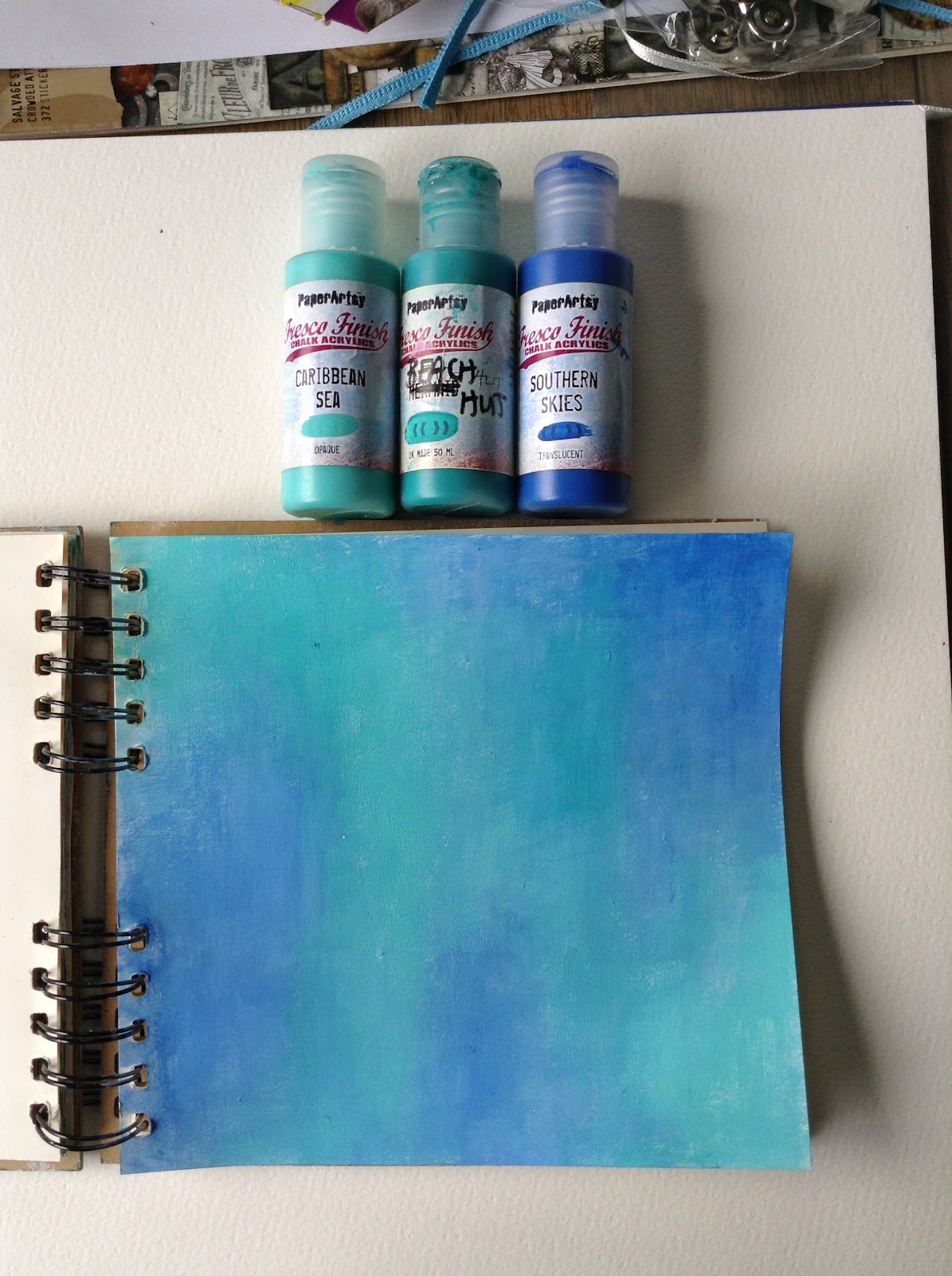
The Blues were much easier, although I had a particular hue in mind to contrast well against the ochre.
Here I've used one of JoFy's new stencils and Glass Blue Fresco chalk paint to begin to create a stencil layer. I also used some DecoArt crackle paint through one of Lin Brown's stencils, just on a whim, but I don't think it added anything to the overall effect.
I used some mini stencils from 'That's Crafty' and 'bumped' the JoFy flower stencil with Snowflake Fresco chalk. This lightened the page a little. I love the stencilling on the little doors against thatochre. 
The next layer involved stamping, using complementary Archival inks. I do tend to work in a similar way to layer up: paint, stencil, stamps, doodling but not always in that order. I often use texture pastes and gels too but on this occasion I didn't want too much bulk as the book needed to be closed.
I do love doodling. I love the way it makes the colours pop. The flowers needed some additional marks to make them stand out too. Now for the main focal areas! This involved a lot of stamping and fussy cutting. Not something I generally enjoy. 
However, JoFy's flowers are generally very easy to fussy cut so it didn't take as long as it looks! I found that bird cage, already set up in a wonderfully appropriate 'ochre' colour, in my stash from way back! When all we used to use, before rusting powders were invented, was good old fashioned 'Distress embossing powders' in Vintage Photo. The chain was again handily found in my stash. Now it was really coming together. I had stamped and cut lots of JoFy's flowers so I could take my time placing them around the pages, either with stems or without and cascading them around the birdcage. Great fun. The butterflies were stamped and coloured with my prisma colour pencils, several times on vintage text paper. I love how by layering them on top of each other they appear to be so fragile. Then I added a quote from a favourite poem by William Blake, again typing the words on vintage manuscript paper. Almost there. 
The flowers were coloured with a mix of Fresco Chalk paints and my Prisma colour pencils. 
And finally, a glimpse of the final page on the other side of the open doors. I do hope you like what I created here because I so enjoyed making it. I love this colour combination so I will make a couple more projects for this challenge. I do hope I've encouraged you to have a go too. I would love to know your thoughts about this colour combo! Until next time! Happy crafting! 


Thursday 23 March 2017

A PA Challenge entry

A warm welcome to all.
It seems very trivial to post this entry to the current PaperArtsy Blog challenge Here in the light of the awful events that have taken place in London and the devastating impact this dreadful act of hatred has had on so many people. And yet, the trivial everyday actions of us all must carry on 'as usual', though we might be numbed for a time by these senseless acts, to show these unseen, unknown enemies of peace and democracy that we are not cowed by this. I know that I hugged my husband, daughters and granddaughters, and wider family and friends, a little more closely to me today.
And therefore I post this recent art work based on the current PA challenge: Doors, windows, Architecture.  I chose to create a rather whimsical 'window' through a page in my small, square 8" X 8" art journal.
I love art journaling. It gives me such freedom to explore different media and different ideas but I often find myself coming back to a particular set of techniques that is heavily influenced by the very talented, generous, encouraging Kate Crane. And this project was just such an example. As it progressed (apart from creating a window I had no idea where it would end up) I became very aware of Kate's influence on it,  to such an extent that I wondered if I should even enter it in the PA challenge under my own name. It made me wonder if there can ever be a truly original idea in art? Surely we are all influenced by other artists, especially those we admire! Yet, there is a fine line between influence and inspiration and copying. Thus the page title! Kate generously allowed me to contribute this to the PA blog but I want to make clear that many of the techniques I explain here were hers first! You can see Kate's own gorgeous work Here. So how did I begin?
As I wanted each page to contrast with each other, allowing the contrasting colour to peep through the window (Kate's idea I've borrowed many times) I set about choosing some of my favourite PA Fresco chalk paints. Of course one of the pages would be in my 'go-to' colours of pinks/ oranges/ yellows.
 
I've used DecoArt Tinting base to add opacity to the more transparent colours and to help create different tones and hues with just the four colours. Another Kate technique. I dry brush these paints onto the page taking time to blend them until I'm happy with the result. It's very easy to blend Fresco paints. 
Again these were blended using the Tinting base with the paints. I'm addicted to this Tinting base. 
The next layer (after marking out where the window would be cut) was some stencilling, using a variety of stencils with the same paints as I used on the blended paint layer. Another very effective technique I learned from Kate. I also scraped a little of one of the blue paints across the page, just a few times. This would help bring both pages together once the window revealed the lower image. I used an old credit card to do this. Then similarly on the following page.
I generally apply layers in a sequence of paint, stencil, mark making, stamping. Sometimes repeated and not always in that order.  I've also added paint on both pages using a little piece of Lego, raided from the grandfairies' stash of Lego. Hope they don't miss it. A great tip from Kate! 
So here you see the mark making with bottle tops, edges of a credit card and more 'stamping' with odd bits of Lego. Kate is famous for her mark making tips and has a good collection of bottle tops. I'm an avid collector now myself! 
This is a close-up of the lower page revealing different marks made with Little Black Dress and Snowflake as well as the blue paints. Now for some stamping.
And a little doodling. A further tip I picked up from one of Kate's DVDs is to add marks with Ranger's Liquid pearls. This is the first time I tried that. Lovely. You can see that I have now stamped the houses in place which will become the main focus on both pages, although only one will be visible through the window. The stamps Ive used are: a mini PaperArtsy house, MN 23 ( I use that one all the time' love it)  and a Carabelle-studio stamp: sa60150. Now I needed to stamp out all the main images on PaperArtsy smoothly paper. The 280gms is perfect for this. I also stamped on some Tumblefish Studio background papers as I wanted to add collaged papers to the houses.
Here I've stamped the mini house several times (sorry, no number on the card) and some of the whimsical flowers from a new set by Elenazinski Art who designs for PaperArtsy: ZA07. I intended to paint the flowers using similar colours to the painted pages but use the collage papers for the little houses.
Now for some fussy cutting before choosing appropriate paint colours and cut out collaged images for the pages. 
Having cut out the window that I had previously marked, I used the collage papers to create a border around the frame. This would later be doodled on to really make it pop. 
It now only needed added text to sum up my feelings about using so many of Kate's techniques.
I love these pages. I love creating windows or cut away pages that offer a glimpse to the page below. It looks so intriguing.
So, what do you think? Did I cross the line? Id love you to leave a comment with your thoughts. Until next time! Happy Crafting! 


Sunday 19 March 2017

Circle Journal #2 /Pages

Hi all! Hope you are all enjoying a relaxing, stress-free Sunday! Just sharing a few photos today of the techniques I used to create two pages in a friend's Circle Journal. The second round is now almost complete and my Circle friends are receiving their own, art-filled journals back as I write! Exciting.
All of the Circle Journals vary in size and shape. I loved this mini size ring book, with lovely, thick grey board substrate to work on. Fabulous. One of our group rules is to use at least one PaperArtsy product on every page we complete. I always use their Fresco chalk paints because they are just so gorgeous to use. They have a huge range of opaque, semi-transparent and transparent (my favourite, some are virtually glazes) paints. I love their brighter colours and there are plenty of them! So, how did I begin?

As I always do, of course: white gesso, paint layers, then stencils. Here I've been trying out some of That's Crafty's mini stencils. Yum. I'm falling in love with mini stencils, including those by Tim Holtz. Such a great idea to reduce their larger ones to a mini size! Hint, hint  Leandra! You might be surprised to see how many colours I used for just these basic layers!

I then chose a new PaperArtsy stencil - PS056, a new favourite - and yet another paint colour to add a further layer which, once dry, I then doodled over.

I do think that a bit of doodling puts life into a background like this. Before I added further layers, I turned over to create a similar background but in completely contrasting colours. I love art journaling like this. I was definitely in my happy place!

Amazing how a few paints can create so many layers. 
I think I'm among many PaperArtsy fans who all love this relatively new Seth Apter colour, Midnight. Now some added doodling before stamping.

Now I wanted a fairly busy background with various stamps, including many PaperArtsy Minis, which I use all the time in my art journal backgrounds. 

And a little more doodling on the flowers. Then the same again on the other side. Now for the main focus. 

I recently bought this gorgeous stamp, designed by Birgit Koopsen ( I think everyone knows how much I admire her art work) for Carabelle Studios. I stamped different parts of this on both sides of the substrate, and then painted around the images with a contrasting colour,  thus painting out a lot of the background I had created earlier. A brave step for some, but a favourite technique that I originally learned from Dina Wakley but has been used many times since by many artists. 

I have to admit that I can't remember what colours I used to paint around the image on the blue background but it was obviously from the pink family of colours! I also dry brushed some Yellow Submarine over the pink in places. But, a little more doodling with a white sharpie/ gel pen and some 
added text completed the two sides. 


It was hard to let these pages go! I need to duplicate them in my own mini journal now. If you haven't tried this technique, I really encourage you to do so. It's great fun, but scary the first time. Thankyou for stopping by, I would love to know what you think. All advice welcome or pics of your own makes would be even better. Until next time! I have a PaperArtsy project coming up soon which I'm very excited about! Happy crafting! 

Wednesday 15 March 2017

ATC/Pocket Letter

Hi everyone! Hope you are all enjoying this very welcome sunny spell - well, those in the UK anyway! Just a short blogpost this afternoon to share some photos of this ATC Pocket letter I made recently as part of a Mini Marvel challenge. This has already been received by Crafting Martha so I feel happy to share a little of the process here.
As you can see, my theme was 'Ladies' Faces'. I love creating collages ATCs. I'm very influenced by Teesha Moore and Nancy Baumiller. These images were a mix of different companies, including Artchix Studio, another favourite of mine. So, how did I begin?
I started with tearing strips of some vintage text papers and sewing patterns. I glued these down with DecoArt matte medium. I then gessoed over them. I prefer Golden gesso but I also love using Ranger's, Dina Wakley's. Hers is thick and smooth. Love it. I watered down the gesso for these as I wanted the vintage text to still show through.
Next, I selected some paints. 
These are a favourite combination of mine. I didn't want the background to be too heavy as the collage images needed to be the main focal area. 
Some added stencilling and stamping to build up the layers before selecting my collage images. 
Once I'd positioned the main face images, I could then add some stamping in black Archival ink and 
some complementary ink colours  around them. Now it was just a matter of adding washi tape and other images to complete each ATC. 
For the reverse I glued another piece of Tim Holtz paper from one of the 12" X 12" paper sets. 
I swooshed each card through some distress inks that had been squished across the craft sheet, and 
water added. 
Hope you like them! I certainly enjoyed making them. I would love to know you popped by! Until next time, have a fun, crafty time! 


Monday 6 March 2017

A Few Cards

Hi there lovely folks
A short post tonight to blog a few cards I made recently with some of the products again from the February Goodie box and a few bits and pieces from earlier boxes. That really is the beauty of subscribing actually. These boxes have so much in them that you will always have product left over. Therefore, it's lovely to dip into the earlier boxes to build up your stash.
I used Kraft card for each of these cards and some of the papers from the current box as backgrounds on two of the cards. The papers are always delicious and it's quite hard to make myself use them rather than keep them. 
The frame around the Tim Holtz girl image - taken from his 'Found Relatives' ideology cards -  is from an earlier Goodie box. I've splattered the background paper with one of the bistre powders Julie included in January's Goodie box, as well as Ranger's Vintage Photo ink, watered down. Everything else is from the current box.
I've run my scissors around the edge of the page and used Vintage Photo again to give an aged appearance to complement the photo.  
Again, I've used various bits and pieces from different boxes to create this card for a friend's daughter who has just got engaged.  I love the wooden/chipboard words from Scrapiniec in February's Goodie box. 
A close up of those gorgeous flowers which I couldn't resist glittering up with some Ranger Stickles - Crystal. 
The final, smaller card made use of one of the gorgeous resin frames that's included in the February Goodie box. The paper needs no further additions. You can see the quality of these 7 Dot Studio papers and you get 10 sheets every time! All varied. It only needed the addition of a few paper flowers to create a simple but elegant card for a friend's birthday. 
There is so much in each box! Having made a large Mixed Media project (see earlier post) and these three cards, I still have a huge amount left to create another project! Thanks for stopping by. I hope you like the cards and will pop over to the website and have a look at these wonderful Goodie boxes yourselves!  Here