Words I will journal by.

Create. Learn. Try. Believe you can.

Wednesday 25 September 2019

The Circle Journal’s return!

Hi everyone. Many thanks for popping over if you saw this first on FB or Twitter. For the last four years several arty friends and I have got together to each create an art journal which we then pass between ourselves i.e. a circle. Each year we select a different theme. This year we each decided on a colour/colours that we used in everyone’s journal as they arrived, through the post, on a monthly basis. We did have a few bumps along the way (e.g.unfortunately this year one member didn’t manage to complete a page in my journal and in a previous year my journal was completely lost somewhere in Royal Mail!) but generally it works out pretty well. My colour choices were: Hot Pink and Orange. I thoroughly enjoyed spending hours - sometimes days - creating pages in my friends’ journals reflecting these colours. I endeavoured each time to produce original and unique pages. And now it is my turn to look through my wonderful pages to see the art all but one member created just for me. To say I’m grateful is an understatement. I’m wowed and awed by their beautiful efforts!
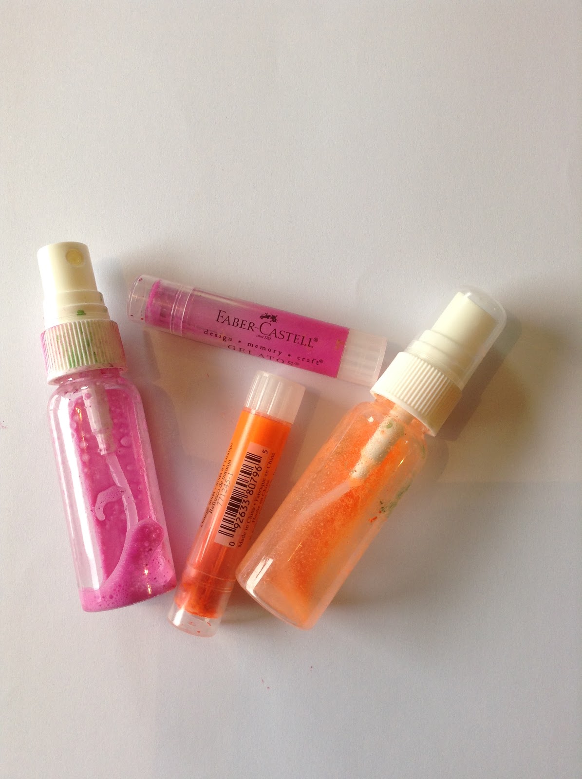
First, here are the pages I completed before it started its journey. Remember, my colour choices were: Hot Pink and Orange - my go-to colours! 


These were the inside cover and first page. The inside cover included a tag with various instructions detailing what I did/did not want to be included e.g. I really don’t like skulls and coffins!

The inside back cover!


So those were my contributions. Now for everyone else’s. first up is Marie Hampton with her stunning Paperartsy images created into two circles!!

Followed by these gorgeous pages by Jules Bell. The colours are fabulous aren't they?

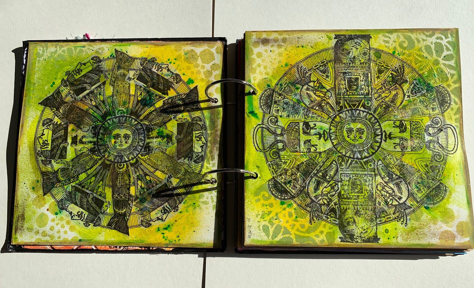
The following spread is by Hazel Agnew. She is such a talented artist that each of us look forward to each of her beautiful creations. I adore this spread. Hazel’s choice of colours was: Forest Floor. 

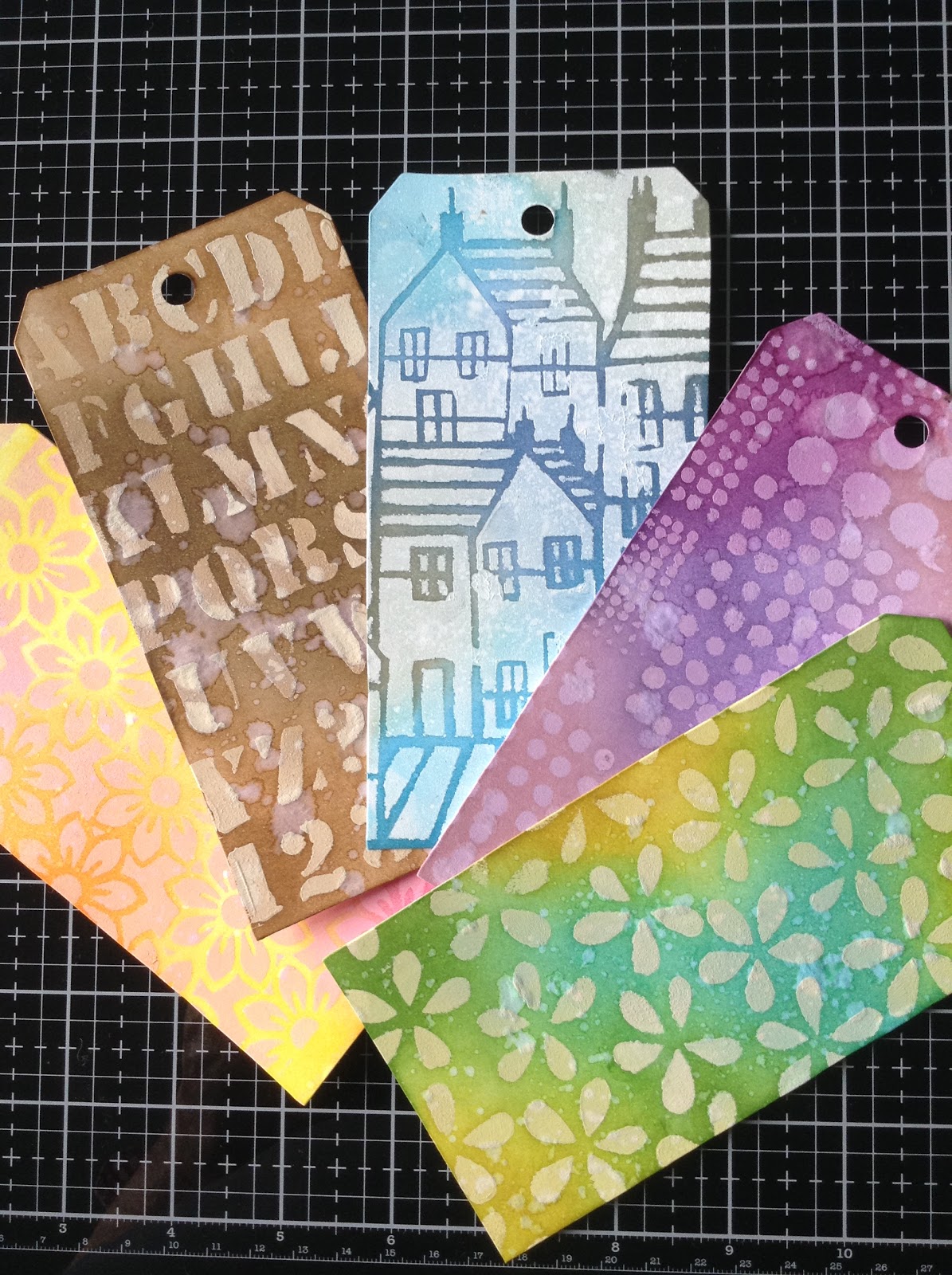
There are always so many layers in Hazel’s art work. I spend a long time stroking these pages! Next up are Deborah Wainwright’s pages. Lovely textures on these pages! 
Catherine Johnson is up next with her funky toadstools! Again, there’s lots of texture going on here too! 
Love those spots! Now the next pages are very special to me as they are created by my lovely BFF,  Linda Regan. Linda has absolutely no confidence in her clear and obvious talents, yet she creates these glorious pages for me!! 


I am absolutely blown away by these pages. Lin has such a great understanding of colours and how to organise a page. I learn a great deal from her quiet, unassuming influence. Don’t you just adore those ‘inchies’ all around each page! Wow! I absolutely love it! Texture, layers, colour - it’s all there in abundance. Thankyou my dear friend. I’m sure you spent hours on these beautiful pages. 

The gorgeous pages above were created by Claire Snowden. The layered colours deserve a close up view. They are gorgeous! I haven’t stopped stroking this spread. Fantastic. Rebecca Hill completed four pages next as she created the clever idea of looking through windows and leaving through a back door. I love it. Such a clever idea! 


It’s lovely isn’t it? I love the whole idea as well as the creative pages. Now for the drama of Sarah Dunkley’s pages:

Sarah’s artwork is so expressive. I am so grateful to you Sarah for finding the time and energy to complete each journal on time when you have so much going on in your life. I’m humbled and inspired in equal measure. Your pages are always dynamic and lively. I adore each one you have completed but this is very special. Thankyou so much xxx
My final pages are created by my dear and Uber-talented friend, Millie Moss. Her colour choice was inspired. This is a colour combination I am now going to be playing around with because I love it so much. It’s so fitting that the last two pages should be autumnal as we are now enjoying the last few September days and entering into an artist’s paintbox of colour that is Autumn. 
Thank you so much Millie. I know how difficult these last few months have been for you but you have never let anyone down. Indeed your art just jumps off the page. Each spread you have produced has been a celebration of colour. I’ve adored seeing every one. 
And that’s it folks. A walk through my gorgeous 4th Circle Journal. Each year the art work gets more creative and inspiring. Will there be a 5th round?? I hope so. Thankyou to my lovely Circle friends, from the bottom of my heart. 


Sunday 22 September 2019

Triple Embossing and Intaglio

Hi everyone. I hope you are enjoying a crafty weekend or looking for inspiration to get your mojo fired up! Sometimes when I’m lost for ideas, a quick scan through my many magazines will provide me with renewed inspiration. In this way,  I love to rediscover old techniques like this one: Triple embossing and the Intaglio technique. I offered a project using these techniques to Sally Stirling (Jarvis) at ‘ Making Cards and Papercraft’ as part of her regular ‘Techniques’ section and it was accepted in this month’s edition (October). I find it so exciting to find my projects in print.

I love triple embossing. There are various craft retailers promoting their own resins and of course there are numerous glazes on the market but, for me, I love seeing the finished result of various layers of embossing on a stamped image. I describe the very simple steps, with photos, in this month’s magazine. If you’ve forgotten or would just like more ideas I would encourage you to buy this lovely magazine. I’ve mainly used a selection of Crafty Individuals stamps for this project but I’ve also included the mini ‘Jane’ face from Indigo Blu.

This photo demonstrates the three layers of Triple embossing quite well. After heating the first layer of embossing powder - I used WOW superfine clear gloss embossing powder and a clear embossing pad - you tend to get a rather bumpy layer. The second layer ( just repeating the process) produces a smoother layer but it’s the third layer that creates the magic. I love it every time.

Hopefully, this photo shows the difference in the layers a little more clearly. I’ve stamped with a Black Versafine ink pad in this image but it’s also great fun to vary your inks to produce multiple images:

Once I had triple embossed a number of images I then mounted them up with complementary background papers to create some birthday/greeting cards. Again, you can see more of these in the magazine.

Crafty Individuals produce some gorgeous background papers which I used for many of the cards I made. 
The next technique that I demonstrate in this month’s magazine is the ‘Intaglio’ technique. This is where you press a stamp image into the heated embossing powders while they are still hot. This creates an ‘indentation’ into the hot embossing paste which lies beneath the surface. When you play around with different colour ink pads and various shades of embossing powders you can produce some wonderful effects. Again, the magazine article shows the steps to achieving this very clearly with close up photos. 
These background stamps are great examples of this technique. The image on the left has been stamped into with a clear embossing pad. The image on the right has been stamped into with a black Versafine Clair ink pad. Both were stamped into embossing powders that had included different coloured WOW powders as well as Ultra thick embossing powders. I stamped into the molten powders when they were still hot. These produce such pretty tiles, especially if you add glitters, beads and findings into the last layer as you heat it. 

I hope that this blog post together with the magazine article has inspired you to have a go at both techniques yourselves! Until next time....


Sunday 8 September 2019

Fun techniques with gelatos

Hi everyone!
Quite late to the blog with my lovely project in this month’s ‘Making Cards and Papercraft’ but it is still available at Hobbycraft, WHSmiths, several supermarkets and craft shops if you are quick! You can order a copy directly from: www.makingcardsmagazine.com and postage is free! You can also buy a digital edition if you prefer. In my project for this month’s magazine I’ve used gelatos in various different ways so if you have these in your craft stash or are new to these gorgeous creamy watercolour pigment sticks, you might well be interested in buying a copy to see just how I created these!
It’s amazing to think that these cards and gift tags started like this! 


I love playing with gelatos and seeing what I can do with them. All thanks really to Birgit Koopsen who first introduced me to these at Version Scrap, a few years ago. The more you ‘play’, the more you find out what you can do with them. They work well on all painted surfaces; you can use them as crayons or you can crumble them and make them into watercolour sprays!

I love using them with stencils. They are so creamy that it is easy to rub them across the stencil and then use your finger to smooth the colour into the cut out shapes. It leaves little crusts of colour where you push the gelatos through. Delicious. 

But this and other techniques are far better explained with lots of photos in this month’s Making Cards and Papercraft magazine! There’s still time to buy it before the October edition is released next week! I’m so chuffed that Sally Jarvis and her lovely team have allowed me to create projects for their lovely, crafty magazine! And to present my makes so beautifully. Thanks for stopping by folks and hope this project gets you looking for those gelatos! 

Thursday 27 June 2019

Tag Technique 7: Alcohol lift technique

Hi everyone, Thankyou for popping over to see this detailed step by step of this Tim Holtz technique. I hope you are as motivated as I am by these amazing products. These are the products I used - and a few more! - for this technique:
I saw this technique demoed at one of the craft shows and was instantly excited. It involves a couple of fairly new products: Ranger's Alcohol Lift (a colour free ink pad) and a new, innovative, plastic card known as 'Yupo'. I used these together with an older product: Ranger's Alcohol inks. You can see in the photo that I prepared my work surface by spacing out the alcohol inks with all the lids off. They are fine like this for upto an hour -according to Tim Holtz. The alcohol lift technique works perfectly on Yupo but if you haven't found this brilliant product yet, you can use Ranger foil tape, acetate or glass. It won't work on glossy card - how do I know that? 😉
However, I did die-cut some glossy card into various sized tags because when you use the alcohol lift ink pad to stamp onto an alcohol inked tag, it lifts the colour from the tag and you can then transfer the ink onto another surface, turning the alcohol inks into a stamping medium. Not only that but the stamped image is then permanent. Who thought alcohol inks could produce stamped images? Well, now it can. Here's some photos demonstrating the process:

This first step uses various alcohol ink colours (I used 4/5 here) which I pressed down over an entire tag before adding a few drops of the alcohol blending solution to help merge the colours. I then pressed down again all over the tag.

I then added more drops of different alcohol inks straight on to the tag, pressed down again to merge the colours, until I was happy with the result. 
 
A delicious result. The tag surface Ive used here is a Ranger product. It's quite expensive - about £12.99 for 5 X A4 sheets! So I hunted around for cheaper alternatives following recommendations by other Crafters. Sadly, I cannot remember where I bought this cheaper pack but it was a lot cheaper! It's also thicker. I think it was described as a chalk board product for schools but you can google it, I'm sure. Here are the results of playing with both substrates:
As you can see, not a lot of difference so far. But how did both and the other substrates cope when I used the Alcohol lift ink pad? Let's see:
Press down lightly on the ink pad and apply a little pressure onto the inked tag. Then lift and stamp onto another tag to get the inked image. 
The same alcohol inks were used on both substrates and there is a slight difference in the results but not such a difference for me to prefer one over the other at this stage. I must admit, the results varied on the cheap Yupo but were successful every time on the Ranger product. Here are the results on the other substrates. 

 
Alcohol inks work beautifully on glass. 
And fairly well on the acetate. Once you remove the alcohol ink to leave this 'ghost' image, it's. important that you lightly dab over the ghost image with a piece of kitchen roll. This gets rid of the remaining alcohol. Don't swipe across until you are sure you have dabbed first and the image has emerged clearly. 
I'm finishing this first part of using the Alcohol lift ink pad with a couple of stamped images on the different Yupo tags. You can see the image is much clearer on the Ranger Yupo but the transferred images are equally good. This is one of my new 'Art by Marlene' stamps. Tomorrow, I will post a second technique using the alcohol lift technique with stencils. Until then I hope you have fun with this technique. 


Monday 27 May 2019

Tag Technique #4: paint resist

Hi there everyone, it's Monday so time for another technique, this one 'borrowed' from Tim Holtz. Are you playing along?
These are the completed tags. A very simple series of steps. This is what I used: 

Select one of your tags and a stencil. Lay the stencil over your tag. Select a light colour acrylic paint from your stash. Either use a blending tool as I did or some craft foam to pounce your paint colour through the stencil completely or partly over your tag. 

Remove the stencil and place straight into warm water. You don't want the paint to dry on your stencil. Heat dry the painted tag. Now, again using craft foam or a blending tool, select two or three Distress ink pads or Distress Stains or the Distress Oxides and blend the colours over your tag.
Although I didn't do this, you can continue to layer more stencils over your tag to create more interesting backgrounds. 

A few more tags using different colours: 
And another: 

The final step is to flick some water over the completed, inked, tags. This just adds to the distressed look. From this...
To this...
A very simple technique but the first of several 'resist' techniques, so more to follow. Hope you are inspired to have a go. Until next time!


Wednesday 22 May 2019

Technique Tag #3: Ghosting

Hi there everyone, Thankyou for popping over for the third technique of the Mini Marvel 12 week Tag challenge. This week is easy-peasy and only needs a few supplies! This technique is 'borrowed' and learned from Dyan Reavely.
Supplies needed are: tags -a good weight as this technique used a lot of water, preferably watercolour or mixed media; ink sprays - I'm using Dylusions Ink sprays, just ensure they are waterbased. You can try different inks though to explore different outcomes; water spray bottle or mister; variety of stencils; kitchen roll.

Start by spraying your tag with water. Then spray a puddle of ink in a couple of places on the tag. Repeat with another colour. Then lightly mist water across the tag to gently blend the two colours.
Immediately place a second tag on top of the wet tag and press down firmly to transfer the excess ink. Peel apart and blot both with kitchen roll.
Select a stencil of your choice and lay this across the top of the two tags and spray through the stencil with water. Try to make sure that the stencil is lying flat to avoid water creeping underneath. This is all a bit trial and error really. You will have varying results depending on the stencil you use and how much water you spray! Just play around until you are happy with your results.
Next, lift the stencil and immediately flip it over onto the bottom half of your tags. Press down firmly and remove. I found more success if i dabbed the flipped stencil with kitchen roll before I removed it. 
You now need to blot the entire surfaces with the kitchen roll. Can you see the 'ghost' effect where the water has removed the ink? It creates such a pretty background doesn't it? However, these inks are not permanent so they will need sealing at some point. Tomorrow I will make some suggestions as to how you can build further layers from this first layer. Meanwhile here are some other colours I played with. 


I hope you have as much fun as I have had if you decide to join in with this weeks challenge. Happy crafting until next time!