Words I will journal by.

Create. Learn. Try. Believe you can.

Saturday 26 September 2015

September's posting in the ever turning Circle Journal

Hi everyone. Posting the various steps in the latest round of the Circle Journal that I'm thoroughly enjoying taking part in. It's so exciting to receive these different journals and open up the pages to such varied art work. It's also quite a challenge to take someone's beautifully made art Journal and put your own ideas into it. But one thing I've learned about Art Journaling is to be true to yourself. And that's how I tackle each one. I have tried, and continue to attempt something a little different each time. This is taking me out of my comfort zone at times and also means I'm not always over the moon with the end result. But each page I complete in each Journal has been approached with great enthusiasm and respect to the owner. So here is the double page spread I did for Gabrielle!
I do love this idea that I first learned from Dina Wakley and Dyan Reavely, of making a background, choosing a focal image and then painting over the space around the focal image. I've done this many times with silhouettes but now playing with using a variety of images. These flowers are created using a StencilGirl stencil. I just drew inside the outline as will be seen in the following pics. Hope Gabrielle likes it. 
I started by scraping, with a credit card, various PA Fresco chalk acrylics across a double page spread: Banana, Tangerine Twist, Bougainvillea and limelight (love these last two).
I kept overlaying the colours until I was happy then added layers of stencilling using the four colours - lighter colours over dark and vice versa. I also added my own marks, again with the same colours, 


 made with fingers and round paintbrushes. This was followed by adding Little Black Dress and Snowflake, and using bottles caps and the side of the credit card. 
Now I needed to decide on a focal image. 
I traced just inside a a StencilGirl flower stencil with black Pitt pen so it would show up easily for painting. I added the stencil word 'Grow' from one of JoFy's PA stencils. It's important to use an open image so the background can really show through when painting around it. Which I did next. I used a mix of Blueberry and GlassBlue Frescos to do this. I used the Glass blue to stencil a pattern (Tim Holtz Gothic) over the Blueberry. 

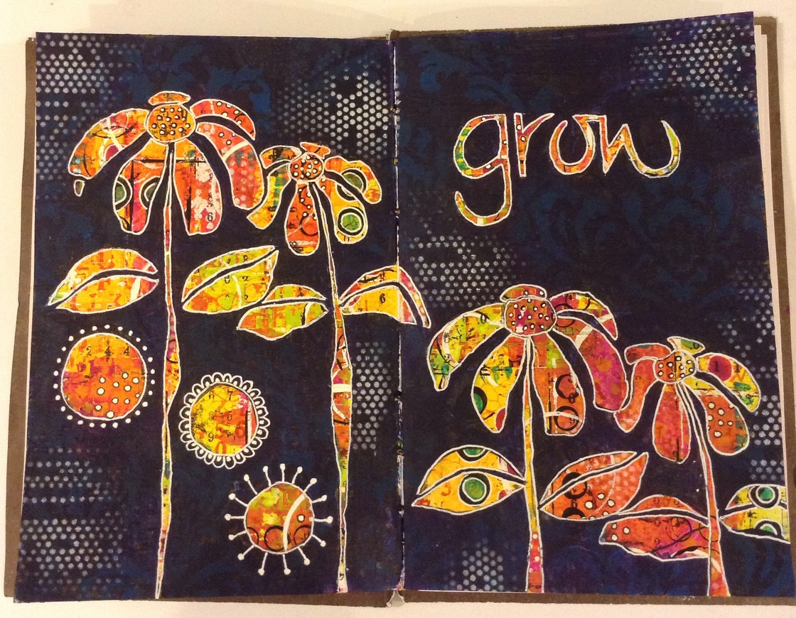
I used a CW stencil to add some white dots around the image just to break up the heaviness of the dominant colour. Outlined the images in white gel pen and added some doodles. But still wasn't quite happy with it. I knew it needed text  which I'd already planned to write cascading down the flowers. But, I knew it needed more! So out came the sprays: crafty notions white matte and perfect pearls 'biscotti'. I love these sprays and use them a lot over finished pieces but quickly realised that I'd probably overdone it. I wanted some of the stencil image in the background to shine through more. So armed with a baby wipe and kitchen paper I started the arduous tack of trying to wipe away some of the spray. I'm still not overjoyed but I'm happy enough with it. I love the way the reds and oranges really pop and I love the GlassBlue stencilling coming through against the Blueberry background. I hope you like it too and would love to know if you popped by! 


Thursday 24 September 2015

New online class

I'm really excited about The very talented Kate Crane's new online class: Marvellous Miniatures: The Art of Altered matchboxes, which I purchased yesterday. You can find this in her etsy shop: The KathrynWheel.  Kate is a great teacher and I've enjoyed many of her workshops at Art From The Heart in Harrogate, Yorkshire, as well as her online class: Journal Soup and her various DVDs.  This new class is great fun, making up little mini matchboxes, filling them with mini cards and journals and decorating them beautifully. I've learned a lot from Kate and am very influenced by her techniques. This class is great value for money and I can see lots of ways I can 'spin' off from the basic match box to making other little mini works of art.
Having watched each of the videos already I'm itching to begin. Fortunately, I already had a mini matchbox kit that I'd purchased from 'Which Craft' last Christmas hoping to make an Advent Calendar with them. I'm so glad I didn't now as I have 24 little matchbox layouts that just need gluing together.  However, I didn't have the larger size that also feature in this class. So the logical thing to do was to work out how to expand the size of the little ones in the kit. After a little bit of fiddling, that's exactly what I did.  So here are my first little boxes waiting to be decorated and made into little works of art.
The little Advent kit matchboxes, when assembled, measure 7cms x 5 cms. With a depth of 2.5 cms. To make the larger matchbox I maintained the 2.5 cms depth but extended the length by 4 cms (to 11cms) and the width by 2 cms (to 7cms). So, assembled, my boxes measure: 11 x 7 x 2.5 cms. However, for the lid I allowed a couple of millimetres to the 7cm widths to allow for the fold. Otherwise the base won't fit neatly into the folded lid sleeve. The resulting measurement for the top sleeve only then was 11 x 7.2 x 2.5 cms. Sounds confusing but actually it really isn't. Here are some photos of the process. Hope they show up as I'm using white 250gms card. It's actually the Gelli card from Clarity Stamps.


A final photo to see the resources I started with. Hope a lot more of you will have a go at making your own. I don't think they will be the exact same size as Kate Crane's but it's easy to adapt her instructions to fit. 
I would love you to leave a comment to show you stopped by! 


Thursday 17 September 2015

Canvas completed at last

Last Weekend I took a couple of classes with Tracy Scott at Art From The Heart in Harrogate, Yorkshire. A beautiful part of the country. It's a good two and a half drive for me but some of the views on the way up are breathtaking! I never finish a project in a class I'm too slow! But I do enjoy spending time on it when I get home. So today I'm posting pics of my completed canvas from the Saturday workshop. I didn't take enough step by steps but you should get the idea. I pretty much followed Tracy's directions, even her colour choices but tweaked it all a bit and added my own doodling. Problem is I never know when to stop! I'm still itching to add yet more doodles so I'm sitting on my hands! Hope you like it. Thanks Tracy for a great class.
We used a selection of Amsterdam acrylics and Dina Wakley acrylic paints. But it all actually started with smearing two or three colours across a Gessoed canvas. Like this:
Whoops looks like I didn't edit and crop this one. I added various marks in contrasting colours and then some stamping until it looked like this:
Now the fun started! I drew the flower ( under Tracy's direction) and added various circles, probably too many but ah well, I love circles!  This wasn't easy as there is so much detail in this background. In the end I went straight in with Pitt pen as I couldn't see the pencil. Risky. Had to get it right first time! Then I painted complementary colours around the painted images. At first I used four colours but soon got rid of one colour as it developed. I've done this before with Dyan Reavely, painting 
around a figure or image in a dark coloured paint. But this was more fun if more fiddly. The next two pics just show further stages in the development! 


I'm not happy with the font I chose but I chickened out of using my own handwriting on this occasion. These words are from a Stencil Girl word stencil. 
Thankyou so much for stopping by. I still have my whimsical animals to finish before I can post those too. I'd love you to let me know you popped in! 

Tuesday 8 September 2015

Launching Clare Lloyd's new stamps

Hi everyone. Thankyou so much for stopping by. Tonight is the launch of the gorgeous new stamps designed by Clare Lloyd for www.paperartsy.co.uk. I was really chuffed that Clare asked me to make some samples for this launch and really enjoyed the challenge! I was given two sets of gorgeous stamps to play with and limited to just a few fresco chalks for each set. This was very good for me as I usually go mad using as many colours as I can get my hands on! Anyway, here are the new stamp sets!

Here are the samples I made with these soooo cute Halloween stamps!

This one and the next incorporated Golden's coarse pumice gel as a base layer. I pushed it through the Gothic arch stencil on the tag and coloured it with primary elements silks and treasure gold. I just adore that little cat. He's going to be well used! The hat on the tag has a layer of glossy accents to make it shine. The bat is coated with Golden's glass bead gel. Love that stuff. The fresco colours are: inky pool, egg plant, Tango, yellow submarine and limelight. 


Next up are the Christmas samples:

 The wings on the Christmas angel are coated in viva's 3D 'schnee'. Sorry have no idea how that translates but it does make realistic snow! (AnneMarie designs)  I then sprinkled TH glitter over before it dried. It does take a long time to dry and harden. I like the simplicity of this design. Just white embossing on Kraft card with circles of text around the focal image. The black and white card uses a simple contrast which I hope you agree is effective, if well used. I use this idea a lot on Christmas cards!

 This last sample is my favourite and one I really enjoyed making. I see this girl more as an Ice princess and the limited colour range helped here too: cheesecake, mermaid (yummy), antarctic, tinned peas and London bus. We were allowed to add silver, Snowflake and Little Black Dress. I really love Clare's linked up snowballs especially stamped on text. Here I used ripped cardboard to create a textured background then collaged her skirt with vintage text strips. Fiddly but effective. The wings are coated in the 3D schnee again.

I do hope you love these new stamps as much as I do. Thankyou so much Clate for allowing me to play with them. I have made a few more tags, journal pages and cards with them, but will blog those later this week! 
Thankyou for dropping in, especially if you were patient enough to read through to the end! Thankyou Leandra for the opportunity to showcase some of my work! Please leave a 'hi' so I know who dropped by xxx

Sunday 6 September 2015

Next round of the Circle Journal

It's time to pass Claire Snowden's Circle Journal over to Linda Regan so I don't think Lin will mind if I post some photos of my finished pages here on my blog.


I started with scraping a couple of Fresco chalk paints across two opposing pages ( lavender and smurf), then adding a variety of torn pages to create some texture. Then I sprayed some Prima color bloom sprays and let them drip down.


Some of the added papers already had coarse gel medium added. I had also added scraps of material I had lying around and plastic netting before spraying. Next,  I added some stamping, mainly paperartsy minis, in both black and white. I also used my new Hot Picks stamps HP1501EZ - great for backgrounds. Now I just needed to add my focal images. These are faces stamped onto material. I'd already made these at a recent weekend workshop with James Sharp. I added a bit more stamping just to include the images into the background. It only needed a quote (Claire had asked for a quote), some chit chat labels and some washi tape to complete. I hope Claire likes it. I enjoyed the process and rather like the result. Especially that gorgeous lavender colour coming through. 
A couple of close ups: 


Thanks for dropping by, especially if you read through the whole post. This is the most I've ever blogged. I hope it worked! 

Saturday 5 September 2015

Tags and ATC challenge for August

Hi there folks. Hopefully, the blog posts will become more frequent when I become quicker at crafting. I've been making some secret stuff that I can't blog about until next week, so that has kept me very busy. Also, making various cards for family birthdays has kept me away from the love of my life - no, not my OH, but Art Journaling! Hope to get on again next week and blog some pages. But my offering tonight is some very late Tags and ATCs for a challenge the very talented Fraser Ives organises for us each month! Unfortunately, I only have the finished designs as I forgot to take pics as I went along. Promise to do better! The theme for this challenge is: Texture. So there are layers of: Golden coarse pumice gel, followed by yummy fresco paints and stencils, followed by Golden 3D gel through a stencil and topped with ephemera and treasure gold! The butterflies are by Stampotique and stamped on text print attached to Ranger's mouldable acetate by Wendy Vecchi. Great stuff. Phew. At least, that's what I think I did. Thanks for dropping by. I'd love to know you've been!

Now a close up of the texture.