Words I will journal by.

Create. Learn. Try. Believe you can.

Sunday 20 August 2017

Book-in-a Box 3

Hi everyone, as promised here is my final step by step, explaining how I completed this project for the PaperArtsy blog challenge, which unfortunately ends tonight. There have been some fabulous creations during the past fortnight which I'm sure has inspired many crafters to make their own books! Have a look at them here.


Once I had completed the box cover and the back of this concertina booklet, I was able to get on with the main reason for making it. I chose photos of all five granddaughters to cover each 'page' of the booklet. It would be too fussy to create a background for the photos in the same way as I had completed the box and reverse of the booklet, so I decided to get out the Ranger Oxides and PaperArtsy Infusions to create some backgrounds to mount the photos on. PaperArtsy Infusions are available in many colours here.


I used various colours and used Tim Holtz's swoosh technique i.e. Squidge some of the oxides across a craft mat, then spray with water and dab some paperArtsy Smoothy 240gms card through the watery ink. It's best to dry your first inky smears before adding more colours. Always remember to dab rather than swoosh though to get the best effect. The original Distress inks are great for swooshing, these are best if you dab! Another language isn't it? I'm no expert with these Oxides or very proficient with the dab technique, but I was successful enough to be able to choose seven that would be useful for the booklet pages. However, I wasn't finished yet.


I decided to add some of the gorgeous PaperArtsy Infusions on top of this base layer of Oxides. There are so many colours now to choose from. I selected colours that would complement the Oxides. In my post on the PaperArtsy blog I have explained which colours I chose. Have a look here. My post was blogged last Friday. There are several ways to use the Infusions but I used the technique where I lightly sprayed over the Oxides with water, then sprinkled a very small amount in the areas I most wanted to cover. I avoided the middle as that is where I would place the photos.


Before mounting the background papers to the booklet, I painted around the edges with Fresco Bubblegum, and stencilled over that with Fresco Tango through a PaperArtsy stencil. I then mounted each photo onto black card before positioning each one on the seven pages in the concertina booklet.


My final step was to use some of the gorgeous stamped images from Tracy Scott's sets from PaperArtsy (again these are shown on the PaperArtsy blog) and place these around each photo. I will add journaling later. So there we have it. My completed Book-in-a Box which I have loved making and will be displayed on the bureau in the Dining room for all to see. Thankyou so much for joining me, especially if you have visited the three posts explaining how I made this project. Until next time...


Saturday 19 August 2017

Book-in-a Box 2

Hi everyone! Many thanks to everyone who 'liked' and commented on this project last night and today. You are such lovely, encouraging people. As promised, here is part 2 of the step by step explaining how I put the booklet together. This links to my PaperArtsy project that you can see Here.if you missed it yesterday.

 
I made the box and the back of the booklet alongside each other so many of the steps which I explained yesterday are also true for tonight's explanation, so I shall try not to repeat myself!
These were the colours I started with. All PaperArtsy Frescos of course. 
As you can, before I laid down the first layer of paint, I ripped up some vintage papers from a fairy tale book. This was serendipitous as it fitted so well with the idea of displaying my five granddaughters' photos on the reverse of this side of the booklet. The story was: The Dancing Princesses. It couldn't be more fitting so I used the title to the chapter as a title for the booklet. Once the paint layer was dry, I used some Golden 3D gel through a bubble stencil in various parts of the entire surface. The final result is lovely because the gel glistens when it catches the light where it's displayed. I'm so glad I did this!

A closer look! 
Now I began a stencilled layer using various PaperArtsy stencils and a couple of Stencil Girl ones. As with the booklet, I carried on adding  complementary colours, but also introducing some Fresco China to contrast against the Reds, yellows and pinks! All the stencils were chosen with the children in mind. They are still very young and I wanted that to come through in the way I decorated it all. 

  
After stencilling I used Tracy Scott's first stamp set that she designed for PaperArtsy to stamp and colour various images across the booklet. I used Ranger Distress Crayons for this. I also added 
various marks using bottle caps and lids, then coloured these with various gelatos in complementary colours. I love the transparency of these. Finally, I added some doodling with black Pitt pens and uniball white gel pens. I also used some paint pens to produce stronger colours in various parts of the stamped images. I just love those flower images in the stamp set. These are available to buy here.
So, there we are. I do hope you have enjoyed reading through my process. I will be back again tomorrow night to show you how I used a mix of  Ranger Oxides and PaperArtsy Infusions to complete my mixed media project. Until then...


Friday 18 August 2017

Book in a Box/PaperArtsy Blog Project

Hi everyone, back again tonight with  my project that is linked/posted on the PaperArtsy blog tonight - Here.  I have loved using Tracy Scott's stamp sets to create this 'Book in a Box' project. The stamps are fabulous for art journaling. I'm sure many of you will know her work. She's one talented lady!
This project took me about four days to complete and I loved every minute I spent on it! I used my favourite PaperArtsy Fresco chalk paint colours. If you saw my blog post yesterday, this project has used virtually all the same ones. I always use a lot of colours, particularly bright ones, when I'm journaling and really, this journaling technique is what I have used on the box itself as well as the concertina book inside! 
I do think that in order to explain the steps I took to complete this project, I need to spread this explanation over 2/3 posts. So, tonight, I'm going to focus on how I created the box. Tomorrow, I will explain how I created the back of the concertina booklet and on Sunday I will explain how I completed it to display photos of my five gorgeous Grandfairies! 
This will give you an idea of all the paints I started off with - I added more colours later, before adding gelatos and PaperArtsy Infusions to the mix. A veritable Mixed Media project. So, how did I begin? 
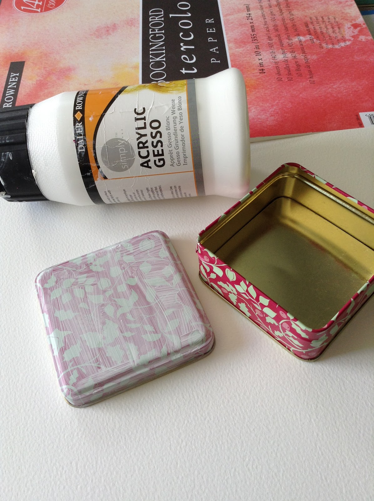
I started with just a couple of Fresco paints after gessoing both the box and the booklet on both sides. I love these colours! 
Then, as I often do, I used some papers I had in my stash and ripped them up to add a layer of collage. These were so pretty and fitting for the purpose I wanted to leave some of the paper design showing through at the end. I also used some modelling paste (Golden) through a stencil randomly over the surfaces, including the sides. 
These are the colours I used to paint over the collage for the next layer as well as both sides of the concertina booklet. 
The next stage for both cover and booklet was to add a layer of stencilling. I have explained which ones I used over on the PA blog, but you can see many of them in the photo. 
Following a lot of stencilling, I added some more marks with gel pens and bottle lids dipped first in Fresco Snowflake, then Little Black Dress. 
Finally, the most fun part, was using Tracy's very first stamp set (and my favourite) to add a layer of stamping. I used gelatos to add colour within the stamped circles as I love the translucent effect over the previous layers. The other stamped images were coloured with Ranger Distress pens.
And this is the reverse. I love Tracy's quirky stamp images and I really love that border strip. I do hope you've enjoyed seeing how this came together and I look forward to showing you how I made the booklet that fits inside tomorrow night. I do hope you will join me again! Until then...

Pop over to the PA blog and have a look at all the wonderful, creative books that have been made over the past fortnight. I'm sure you will be inspired to have a go yourself. If you missed my blogpost yesterday, do have a look as I created a mini version of a concertina book in a tin! I love making mini books. 
I'd love you to comment below and let me know your thoughts!


Thursday 17 August 2017

Oodles of Doodles

Hi there everyone!
Well, I should be in York today with my older two Grandfairies but the visit has been postponed to next week as the forecast was 60% chance of rain! Fingers crossed its better next week.
I've had a lovely few days art journaling and completing some projects for PaperArtsy! The current theme is 'Book making' and although I'm no Wendy Mallas, I do love making journals and mini books in boxes and tins. So, after I'd finished a larger (took me ages) blog project for PA (due to post tomorrow at 7pm so please visit Here), I was hooked on making another, even smaller, booklet. I had already seen a post by Birgit  Koopsen where she created a mini book to doodle in. I loved that idea so I made my own version using PaperArtsy Fresco chalks and lots of PA stencils. All available Here.

 I started with the tin!
After two or three coats of gesso, I used a dry brush technique to add some of my favourite colours. This is for me so I was definitely going to use my favourite colours. 

As you can see from the lid, after an initial layer of paint, I started adding some PA stencil layers.
This one is PSO15. Then, lots more .
The one I have layered on top here is a mini stencil PM008. Next, I mixed some Bougainvillea Fresco chalk paint with some Golden modelling paste and pressed this through the middle of Tracy Scott's fab stencil PSO53.
This was left to dry overnight while I started on the mini concertina booklet that would go inside. 

I used Bockingford Watercolour paper 140ibs and managed to get three strips out of one 10" X 14" page Each section measured 3" X 3".
These strips were then attached to create one continuous concertina strip. Now, the fun part. This took a lot of painting. Dry brushing again to help blend the colours. 
Now, on top of this base layer of blended paint, I selected lots of stencils. Mostly PaperArtsy stencils but also a selection of Crafters Workshop, Clarity and Dylusions. After all, I had a lot of surface to stencil and although I intended to add some stamping this was intended to be mainly stencilled as I intend to doodle over the top. 


I used several colours to stencil over the base layer, varying the sections with light and dak colours. I wanted to leave plenty of opportunity to doodle on each section
And there we are! All ready for me to while away a few spare hours, especially waiting at the school gate for my Grandfairies to come out, and doodle to my heart"s content. I've already doodled on top
fo the coloured modelling paste on the tin lid, using a uni ball white gel pen although that will need to be sealed. I do hope you like my little booklet. I love it!

Until next time!xxx

Saturday 5 August 2017

Contrast and Layers: PaperArtsy Project

Hi everyone, hope you are all enjoying some sunshine wherever you are! A mixed day here of sun and rain but I've been in my happy place: art journaling. My post tonight is a link up with the PaperArtsy blog: Here where I created an art journal page exploring the theme of contrasting dark and light layers. I loved completing this despite a lot of time spent cutting out a lot of Kim Dellow's gorgeous stamp images from her PaperArtsy Eclectica set: ELD06! A fabulous set for art journaling. I'm in love with the Daisy flower on this set.
I started by making the 'flowers' - I'm not sure that they are all flowers as they are certainly not all a typical flowers shape. They are gorgeously 'doodly' which is why I love them! I decided to use the gelli plate and a variety of substrates to produce dark and light contrasts within the 'flowers'. This also   avoided merely colouring in the images. The gelli plate achieves this more quickly and easily than I can by colouring and shading! I use a lot of colours when I'm art journaling and more so when I use the gelli plate. The great thing about PaperArtsy Frescos is - there's a lot of them! Such a variety of different tones and hues. I planned to use blues and greens and those colours either side of these on the colour wheel, thus only using analogous colours, so for the flowers I opted to use the lighter end of these colours to contrast with a much deeper, more bluesy background.
 
These are the ones I selected from the many I made! I love these monoprints results so much that I find it hard to stop. Each one is such a marvellous surprise. I used deli paper, PaperArtsy Tissue 
Stock, some pearlescent heavy weight papers I had in my stash and PaperArtsy 240gms SmootHy 
card. The ones I selected were a mixture of these. All from these colours: n
Delicious aren't they? As you can see, I have kept to the lighter turquoises/teals and yellows for the stamped images. This still allows me to produce dark and light contrasts within the 'flowers' but will also contrast with the much darker blue/violet background I had planned to place them on.
Before stamping and cutting the images out, I first stamped randomly over the monoprints, again to incorporate some dark and light contrasts within the 'flowers'. Now to make the background! 

I selected some darker tones but still within this colour family. To get the first couple of layers down quickly, and to blend them smoothly, I tend to use a baby wipe! 
My technique is usually the same for all my backgrounds: I start with selecting opaque colours for a first layer then incorporate more transparent colours over the top, leaving dark and light areas as I go. I then use various stencils to the next layers and alternate dark colours over light and light colours over dark. I carry on adding more and more paint through various stencils until I'm happy with the result. 
I've used a mix of PaperArtsy and Crafters Workshop stencils here. I do love those little flower stencils by Emma Godfrey: PM 008/ 02. I also love the complementary stencil set to Kim Dellow's stamp set: PS048
I have described how I used one of Kim Dellow's stencils and turned it into a stamp over on the PA blog. I used a Distress Oxide to do this. It's the lime coloured leaf on top of this background. This was added to echo the yellow/greens in the stamped images. Now it was just a case of arranging the 'flowers' across the background. Of course, a lot of stamping, doodling and further playing has also happened to this background! 

Here's a close up...

I hope you like my art journal spread and feel I've achieved what I set out to do i.e. Produce a contras
t of dark and light layers. Sadly, this is the final day of the current PA theme, but that doesn't mean you shouldn't have a play with this idea in your own art journals. Thankyou for stopping by, I would love to read your opinion as to whether you think I achieved it! Until next time! 


l