Back again to share the process steps of the pages I created in Wanda Hentges Circle Journal. I and 11 FB friends have been sending our journals around the UK and over to the US to allow each of us to create art on at least one page in each others' journals. Great fun. This last 'Cycle' has taken a year to complete and Wanda's journal has now been received by Catherine before winging its way to Wanda in the US. I know she will be delighted with all the glorious art work inside. Here are the pages I created for her...
We decided to create our journals this year using envelopes. It was amazing to see 12 completely different ideas on how to do this. All journals were handmade. I'm hoping to post photos of several of them on here at the end of July, so watch this space! I might even be brave enough to try a Facebook live! So, how did I start this journal spread?
I started by brayering the colours you can see in the photo horizontally and vertically across the envelope pages which I had previously gessoed. These are new PaperArtsy colours produced by Seth Apter, and paints by Dina Wakely for Ranger Indistries. They really are delicious and produce a very different colour blend to the ones I usually go for. But I wanted to produce a more subdued background for the flower images I intended to place on top.
The next stage was to use some DecoArt Crackle paste through a stencil to create some interest in what would be a rather plain, unfussy background - not like me at all, but I was aiming to produce a style I felt Wanda would prefer. I wanted to keep these quite light and ensure some white space in the finished page.
More colours were added, very lightly with a small brayer this time as I just wanted to catch the raised crackled pattern and the pages. This is so unlike my usual Gung-Ho attitude to paint, but it felt good! The paints used here are: Eggplant, Purple Rain, Butter and Beach Hut. All Paperartsy Fresco Chalk acrylic paints, available here: www.paperartsy.co.uk and some local retailers.
The next step was to add some stamping, but again, I didn't want this to be intrusive so I only used bits of stamping here and there. I used a Paperartsy Hot Picks stamp set: HP1501EZ and a Mini Stamp: MN41. I used two contrasting colours to do this: Eggplant and Butter. Next, I added some simple stencilling using the same contrasting colours and adding a touch of green with Magic Moss, another of Seth Apter's new colours.
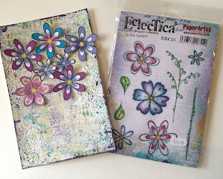
Now it was beginning to look interesting and I was falling in love with it! Best to leave it when I'm happy. So, I started stamping out the gorgeous little flowers I was anxious to use, a new set designed by Kay Carley, for PaperArtsy.
I kept very much to the colours I had already used but, of course, Bougainvillea - another PaperArtsy Fresco Chal paint - had to make an appearance. It's my all time fave! So, some new paints, some older ones, but all Fresco Chalks. I really like their matte, yet quite bright, finish.
So, with the addition of some of JoFy's stamp sets from previous releases, I was able to complete the whole spread. I'm particularly pleased with myself for using PaperArtsy Fresco Chalk paints to colour all the leaves and flowers. I'm not usually very good at doing this and generally resort to my Copic pens, but I'm really pleased with the blending and will completely ignore the mistakes! I do hope you have found this post useful. If so, I would really appreciate a brief comment. Thankyou so much for popping by. Until next time, happy crafting!


